Background
During my time in the company, the executives decided to launch the MMI (Money Matrix Integration) project, which is to merge the old site (TMX Money) with the new site (TMX Matrix) and apply a new design language. As the result of this effort, we have successfully migrated 70% of existing users to the new site.
Overview
When I started redesigning the Trade History page, I examined all the features to determine their value and the functionality they provided. The main purpose of this page is to provide accessible historical data for the users to examine on all devices.
Research
Data Table - Enhancing Data Viewing Across Devices Through User Behavior Analysis
The Trade History page included two main sections: the data table and the date picker.
optimize the data viewing experience for all device users, I have observed the user behavior by using Hotjar, the analytic tool that reveals the online behavior and interaction of users. Due to the lack of spacing on responsive mobile, the data tables were not available to view at all on the older version of TMX Matrix.

Example of price history page on older version of TMX site on mobile size.
Date Picker
In order to understand the user’s experience with the date picker, I simulated the following scenarios and did some usability test with the design lead to examine the experience with the original date picker.

Example of a similar design to the older version of TMX site's date picker.
01. Identify user Scenarios
In the page redesigning stage, we usually observe or interview users to understand their behavior. However, with the limited time and resources, we decided to use internal testing for common components, such as the date picker.
We have listed the following five interaction scenarios:
- Picking a short range of dates within 1 year
- Accidentally picked the wrong ending date
- Accidentally picked the wrong starting date
- Picking a long period of time that’s more than 2 years, 5 years, and more
- Picking a specific date only
02. Usability Testing
The goal of usability testing is to identify areas of confusion and discover opportunities to improve the overall user experience. The design lead and I performed usability tests and documented our results.

03. identify the problematic scenarios
We ended up finding that our original date picker was not very convenient to use. With the original design similar to the example display below, users could have cumbersome or confusing experiences in the following scenarios:
- Scenario 2: The problem was user needs to pick an a new starting date in order to pick a new ending date
- Scenario 3: The problem was user needs to pick an end date in order to pick a new starting date
- Scenario 4: The problem was user needs to click many times in order find the desire year
- Scenario 5: The problem was user doesn’t know how to pick a specific date
Define
User Research
During the research process, some surveys and user interviews were conducted with our existing users and new potential users. From all the research, I have got the following findings that can brought an insight for this page:
Insight
- 93% of users prefer table form of presentation.
- 18% of users would view on tablet, 46% on mobile, and 36% on desktop.
- Users often compare data as a set (ie: Open Price with Lowest Price).
goal
- Keep the data table, make it easier to read but stay informative.
- Make sure the design is inclusive for wide age range of users.
- Make data table responsive and is not necessary to put everything on one screen in smaller screen devices.
Develop
By prioritizing user data preferences and insights, I redesigned the data table to enhance investment decision-making.
To redesign the data table, I reordered the headings in better-comparing order for users to make their investment decisions. The heading's order is defined based on the user’s data comparing preferences according to Hotjar and some investment insights from professionals.
Moreover, the table was redesigned with a sticky column on the left, which is the main column that contains the base information for reading data effectively. In this case, you can easily find the date it corresponds to even when you scroll horizontally to read other data.
This table design was later applied and reused in other modules as well.
Date Picker
In terms of interaction, I have a solution for the problem encountered in scenario 2 and scenario 3. I decided to preserve a five-day error tolerance, in other words, when the user reselects the new start/end date, the user can instantly change the date within five days, instead of ending a round of selection as before.
Scenario 2: Accidentally picked the wrong starting date.
The problem was user needs to pick an a new starting date in order to pick a new ending date.

Scenario 3: Accidentally picked the wrong ending date.
The problem was user needs to pick an end date in order to pick a new starting date.
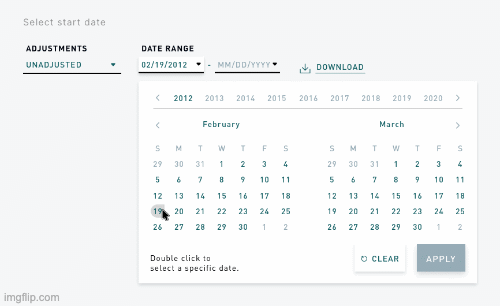
By restructuring the date picker, users are now allow to select “years”, “months”, and “date” individually, for the best practice to check out the widest range of price history records.

Scenario 4: Picking a long period of time that’s more than a year.
The problem was user needs to click many times in order find the desire year

Scenario 5: Picking a specific date only.
The problem was user doesn’t know how to pick a specific date.
The final date picker has become much more convenient after testing, and I have designed different styles for different screen sizes.
One thing that I regret is that at this stage we only provide the web form for mobile size instead of app, so we can't use the scrollable date picker that app uses to achieve more intuitive interaction.

Screen size 1440~768 px

Screen size 765~320 px
UI Kit
About the Company
The TMX Group is a large Toronto-based financial services company that operates the Toronto Stock Exchange (TSX), and TMX Matrix is the product that provide a platform for venture trading companies.
Main Duty
UX Design : understanding the acceptance criteria, brain-storming user flow, research on design trends, observe user’s behaviours from Hotjar, and draw responsive wireframes(including desktop, tablet, and mobile). Eventually refine the interactions, check with developers for applicability, and further refine with the POs and other designers.
UI Design : transforming well- thought UX wireframes into pixel perfect and high fidelity prototypes, make sure the design is aesthetic and follow the company’s branding. Prototype update to InVision, and saved on Abstract. I’m also responsible for creating empty/error state graphics and helping to create the UI library.
Design Quality Assurance : testing the implemented design in these standards - Is it matching the design? Is it meeting the accessibility standard? Is the responsive working in desktop/tablet/mobile, and are they delivering the UX experience fluidly?
Time Management/ Organization : we adapt to Agile scrum system in TMX, I’m trained to use Jira, participated in retrospective and daily standup meetings to keep everyone updated. I’d also keep track of my tasks on my notes, my calendar, and keep files updated on Abstract.


